Wednesday, March 27, 2019

OMO


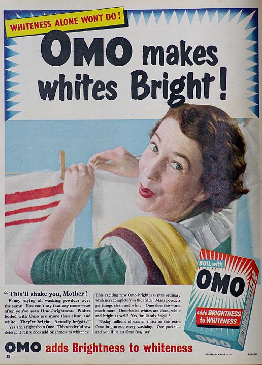
1) What year was the advert produced?
omo was produced in the 1950s.

2) How were women represented in most adverts in the 1950s?
women were represented as house wives who have domestic duties.

3) How does the heading  message ('OMO makes whites bright') and typography promote the product?
It's short and it's a strong heading which shows the audience that OMO is one of the best washing powder there is to use.


4) Analyse the mise-en-scene in the advert (CLAMPS): how is costume, make-up and placement of the model used to suggest women's role in society?
The make up is done perfectly for the women which indicates that even if she cleans she will still look pretty.

5) Why is a picture of the product added to the bottom right of the advert?
The picture is added to the bottom right which shows that it's big and it's worth a lot of money.

  6) What are the connotations of the chosen colours in this advert?
In the advert there is white red and blue colours used. These red and blue colours shows the audience that the advert is very basic or old as they haven't used a variety of colour which shows that the advert is old.

7) How does the anchorage text use persuasive language to encourage the audience to buy the product? Give examples.
OMO uses bold text to makes those words stand out with black colour on a white background so it can stand out to people.

8) What representation of women can be found in this OMO advert? Make specific reference to the advert and discuss stereotypes.
The advert indicates that women only clean/cook and there supposed to look pretty everywhere they go.

9) What is the preferred reading for this advert - what did the producers of the advert want the audience to think in 1955?
The people in 1950s would buy this product and not have any thoughts on sexism since they were all used of it in 1950s.

10) What is the oppositional reading for this advert - how might a modern audience respond to this text and the representation of women here?
 The oppositional reader would think that the advert is horrendous since its very sexist and they would want the company to delete the OMO advert. 

Thursday, March 21, 2019

Gender representation in advertising


Image result for 1960s sexist adsImage result for 1960s sexist ads
1) Find three adverts featuring women that are from the 1950s or 1960s. Save the images to your Media folder as jpegs and then import them into your blog post. Hint: You may wish to look at car, perfume or cleaning products but can use any product you wish.
Image result for adverts in 2000 women Image result for adverts in 2000 womenImage result for print ads 2000s


2) Find three adverts featuring women that are from post-2000. Save the images to your Media folder as jpegs and then import them into your blog post.

3) What stereotypes of women can you find in the 1950s and 1960s adverts? Give specific examples. 
A stereotype are shown by women in adverts portraying house wife,servant and good looking.


4) What stereotypes of women can you find in the post-2000s adverts? Give specific examples. 
Women are shown as more sexually since they use there body in adverts and domestic.

5) How do your findings suggest representations of gender have changed over the last 50 years? 
In the 1950s adverts women were shown as domestic and sanitary however in the 2000s women are shown more sexually and women are hardly shown on adverts doing domestic duties. 


LR for tatler


WWW- The Reveal blog task suggests that you have tried hard to write more at GCSE level and in more detail. Better understanding such as ‘pink connotes feminine’

EBI- a lack of detail in some of your answers. 

LR- Re-do Tatler by reading your sister’s answers and then writing your own answers. Also, do the two remaining Reveal questions that you have not tackled (5 and 6)

Friday, March 15, 2019

tatler


1) Based on the trailer, what type of people produce and read Tatler? 
Consider demographics and psychographics. Upper class ,wealthy,age 18-30 who are rich.


2) Look at the Tatler Media Pack 2018. Go to page 2: how does the editor introduce the magazine?             The editor introduces the magazine as luxurious,wealthy and its targeted at higher class and high income audience since the magazine is expensive.


3) Now go to page 4 of the Media Pack. Focus on the print magazine (NOT tatler.com - the website). List the key demographic details: age, gender %, ABC1 % (social class), HHI (Household Income), % of those living in London and the South East. What do these demographic details suggest about the average Tatler reader?

age:30  circulation 80,035  readership 163,000  Average HHI £261,572  female 73% ABC1 83%

4) Look at page 6. What do Tatler readers think about fashion? How much do they spend?
Tatler audience think that the fashion industry must be expensive and fashionable since the amount of money that they have spent on fashion in the past year was £843 Million and 96% of Tatler readers only buy and wear designer fashion which is a lot of money.

5) Go to page 10. What are the special editions of Tatler that run throughout the year? What does this suggest about the pyschographic groups who read Tatler?The special editions of Tatler (Travel guide, Weddings guide, Beauty and Cosmetic Surgery, spa guide, watches and jewellery guide and schools guide).The spa guide suggest that its aimed at rich people who can afford spa's and cosmetic surgery.


1) How many of the 12 magazine cover key conventions feature on this edition of Tatler? Title of publication, slogan, central image, colour scheme, cover line, name checks.

2) What is the font choice used in the title and what does this choice connote? The font used is serif and it connotes seriousness, posh and formal. 

3) What font is used for the cover lines? What does that choice connote?
San serif which connotates accessible,fun,friendly and modern 

4) How do the cover lines appeal to the Tatler target audience?
Cover lines appeal to tatler target audience because it gives them information on what the magazines on to persuade them to buy their magazine.

5) What are the connotations of the Tatler colour scheme on this particular front cover?The connotations of the tatler colour is that only uses three colours pink,green and yellow which are rich wealthy colours. 

6) How is the central image designed to create interest in the magazine? Find three reasons for your answer. (E.g. Mise-en-scene such as props, costume and make-up, body position, facial expression)The central image of this magazine is a rich model. She is wearing golden clothing, which shows she is wealthy  since gold is expensive, making the magazine seem posh and wealthy so the target audience is a richer demographic.


Representations

1) What different groups of people are represented on the cover? (Look at the image and text/cover lines)
The different groups of people on the covers are represented as rich wealthy females.

2) What do the cover lines suggest about the lifestyle of rich people in the UK?
The cover lines suggest that the rich people are only interested in partying with celebs and buying expensive clothing or jewellery. 

3) Are there any stereotypes being reinforced or subverted? How? Why?

Stereotypes that are used are that the young rich women are all interested in gossip and fashion. However the image is described as strong and very confident.


4) Are there any misrepresentations or under-representations of groups? What might this suggest about the target audience? There is no representation of middle which suggests that the audience are mainly upper class or upper-higher middle class
5) What would be the preferred and oppositional readings to this cover of Tatler?                                     
The preferred reading is the Tatler cover is modern, unique and fashionable. The oppositional reading is the magazine is too expensive and expensive clothes and accessories are unnecessary. 


Social and cultural context

1) What aspects of British life or people are NOT reflected in Tatler? (Watch the clip above again if you need help with this - the clue is in the title 'Posh People')
No lower or working class are shown since tatler is focusing on posh and wealthy people.

2) Tatler runs special issues on holidays, spa breaks, cosmetic surgery, watches and jewellery and private schools. What does this suggest about the magazine's representation of life in Britain?

3) What audience groups might be offended or insulted by the front cover of Tatler April 2017? 
The audience groups that might be offended or insulted are people of colour and men. This is because they are not used as male models or people of colour in their magazines. 

4) Find three other front covers for Tatler. What issues or problems are regularly featured in Tatler? 
The issue is the models being slim since the audience feel like they have to be have a good body and be skinny to be accepted by the society.

Thursday, March 7, 2019

Advertising key conventions


Related image
1) What key conventions of an advert can you find and what are the connotations of each one?
colour scheme,list of three,logo,slogan,alliteration

2) For each convention, write about how this appeals to a target audience. 
This would appeal to the audience as this shows that the burger is Delicious and mouth watering.

3) What is the USP (unique selling point) of the product and how do you know?
 The USP for this product is the image of the 3 burgers. By seeing the 3 burgers the consumers would think this is good tasty and would want to buy it.
 
The usp for this is that heinz is so popular that they didn't even use thier product.

daily mirror

Language 1) Write the definition of the following key language for newspaper front pages: Masthead:The title block of the newspaper Pug:Som...